Netherlands T-Mobile’s Remarkable Rebrand to Odido
A Semiotic Evolution in the Netherlands Telecoms Sector The Power of Rebranding in the Telecoms World

In the ever-fluid world of telecommunications, rebranding serves as a potent tool for organisations to reinvigorate their identity, align with evolving business strategies, and resonate with a dynamic customer base. T-Mobile, a prominent player in the industry, has recently made headlines with its transformation into Odido. This audacious move signifies a noteworthy pivot within the Netherlands telecoms sector, reflecting a strategic evolution for the company, with a focus on semiotics and simplified branding shapes.
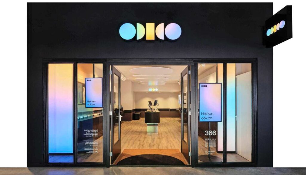
Odido: A Name for the Modern Age
T-Mobile’s decision to rebrand as Odido is a testament to its dedication to remaining relevant and pioneering in a fiercely competitive industry. The new name, Odido, is not just catchy; it’s designed to be SEO-friendly, ensuring it captures attention in a crowded marketplace. The choice of the name Odido represents a semiotic shift towards simplicity and memorability in branding, a trend increasingly recognised in today’s visually saturated world.
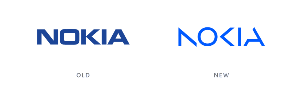
Nokia’s Semiotic Journey
Comparatively, Nokia’s recent rebrand also embodies this shift towards semiotics. The iconic company, known for its durability and reliability, simplified its logo and visual identity to a clean and minimalist design. This change reflects a broader industry recognition of the importance of semiotics in creating strong brand identities.
Visual Aspects of Odido’s Rebranding
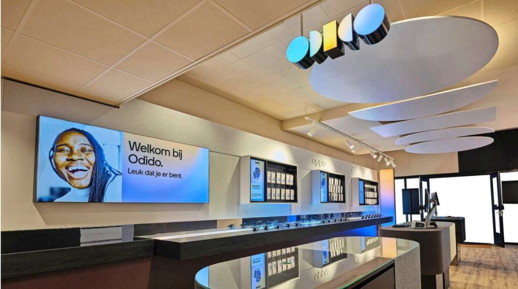
In contrast to the previous magenta, Odido’s rebranding embraces a vibrant and audacious colour palette. The use of simplified branding shapes, such as the sleek and modern design of the revamped logo, signifies a forward-looking approach and a resolute focus on the future. These semiotic choices communicate Odido’s commitment to seamless connectivity and pioneering innovation in a visually concise manner.
Investing in the Future: Beyond Aesthetics
Beyond the visual aspects, Odido is making substantial investments in network infrastructure, expanding its 5G coverage, and enhancing customer service. This all-encompassing rebranding strategy, with its semiotic focus on simplicity and clear branding shapes, positions the company as a trailblazer in delivering dependable and seamless connectivity.
Elevate Your Brand with Our Expertise
The rebranding of T-Mobile to Odido showcases thoughtful design and modern semiotics in shaping brand identities for the future. If this inspires you, it’s a great time to consider how your own brand can benefit from a makeover.
We specialise in providing design solutions, from logo creation to visual branding and beyond. Our team is passionate about creating unique designs that not only stand out, and push the boundaries but resonate with your target audience.
© GeoBrand. All rights reserved.