A look back at 2020
This is it, it is almost finally the end of 2020 and with this 'dumpster fire' of a year came many interesting challenges, opportunities and fun for both the business but also the team, but before the sun sets on the year, we want to celebrate all the great things our team and clients have achieved.

Geo Projects
We have worked with various businesses throughout 2020, across London, Kent and the UK from hospitality, law, health care, travel, fin-tech, financial, wildlife charities and many more. Here are some of the projects that you may have missed.
The opening months we found ourselves with an abundance of digital work, for the likes of Hallet & Co solicitors based in Ashford, The Guild of Young Freemen, Marshall Harrison International to name just a few. We helped all of these companies to bring fresh new looks to their websites as well as rethinking the UI/UX and the way users navigate through their websites. As well as this, we also thought about how their brands work and look further than just their websites and how they can be more successful by rethinking design elements such as logos, typography colours and brand messaging.
Later on in the year, as the first spike of the COVID-19 pandemic began to settle and shops started to open, we helped the Portman Estate to create a vibrant, exciting and welcoming collection of typographic signage to welcome shoppers and restaurant-goers and ensure they stay safe during their visit.

In the Autumn we launched the brand new brand for GeoBrand and the website to help elevate our business growth. Furthermore, we launched the inhouse project ‘My Pub Takeaway‘, a website that lists a directory of pubs that are offering takeaway meals for people to collect within their local area.

We’ve also been working on some incredibly exciting projects towards the end of this year, for the likes of CharterSync, Somerset Wildlife Trust and Chegworth Valley, we can’t wait to share these with you in the new year.
Team Geo
A lot has happened in 2020 for Geo and the team; working from home, a steady flow of great projects and also plenty of fun for the team to replace our Friday afternoon pub beer.
One of the best highlights for the team this year was a trip to watersport centre at Bewl Water as a post ‘lockdown 1’. The team enjoyed an afternoon of bonding, mischief and fun as they took to the water and had their paddleboarding skills put to the test, or as for Shaun, he took his paddleboarding skills into the water… multiple times. Congratulations to Andrew who managed to do a headstand on the board.
The Geo team has seen substantial growth this year despite the hard time the world has seen. Rosie Hewett joined the team in the autumn as Marketing Executive, experienced Web Developer Aleks Krasnovskis joined our growing digital team and finally, Terry Hewett joined as Geo’s new chairman.

Industry Insights
Despite the hardship of the year for both the design industry and the economy of the UK, we have seen graphic design and creative agencies continue working hard and creating some incredible work to help their clients continue to push their brands to the next level. Here are some of our favourite picks from 2020
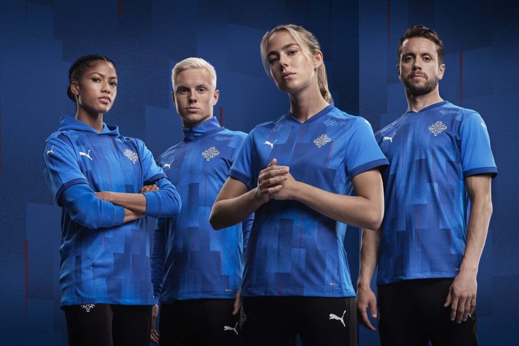
Iceland FC (KSI)
In recognition of its growing profile, Iceland’s national football association, KSI, unveiled a new identity for the Icelandic team. KSI worked with Reykjavík agency Brandenburg to create the identity, which includes a new logo and a custom typeface. We absolutely loved everything about this rebrand, from the striking use of typography to the elegantly put together icons, it is the perfect example of a 21st-century brand that has successful uses in all of its touchpoints.
Cadbury
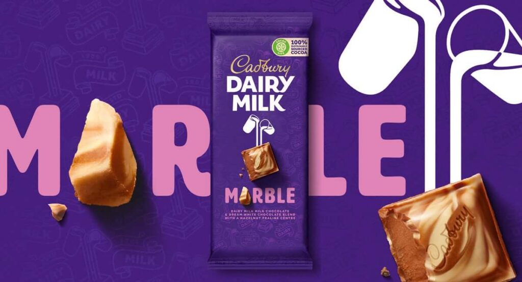
Cadbury is one of the finest examples of one of the worlds most iconic brands, but there is always an opportunity to tweak your visual identity to ensure you remain at the top. Created by design agency Bulletproof, the refreshed Cadbury wordmark is a contemporary take on the signature of the company’s founder, John Cadbury. Meanwhile, the agency reimagined the Dairy Milk Glass and a Half logo so that it links directly with the brand’s chocolate chunk symbol, and developed a new pattern for the chocolate based on its original packaging from 1905.
Pantone colour of the year
Following a horrible 2020, Pantone has opted for a double colour of the year, choosing grey and yellow to communicate “a message of strength and hopefulness”. Pantone 17-5104 is described by the colour company as “solid and dependable”, akin to pebbles on the beach, or weathered natural elements that have stood the test of time, while Pantone 13-0647 is described as “sparkling with vivacity, a warming yellow shade imbued with solar power”. It is certainly an interesting choice this year from Pantone to choose a grey but paired with the yellow, we believe it shows a sign of vibrancy and positivity after a horrid year for all.

To all of our colleagues, clients, collaborators and friends we want to say: thank you. Here’s to a happier, healthier 2021, we can’t wait to see what comes our way in 2021, and to continue to help launch and grow our client’s businesses further.
© GeoBrand. All rights reserved.