Top 5 design projects from January
So, it’s 2021 and we’re already in February, how did that happen?
With the new year kicking off to a bit of a slow start, I wanted to reflect back on January and the inspirational design it has brought us.
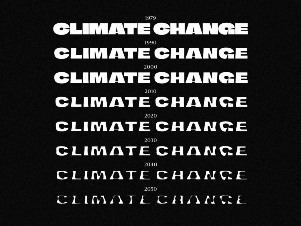
First of all, I wanted to take a look the Climate Crisis, by Helsingin Sanomat. Finland’s biggest subscription newspaper revealed a climate crisis typeface last month, which visualised the effects of environmental decay. As you can see the letters’ weight varies according to information collected from the National Snow and Ice Data Centre from 1979-2019 and continues in alignment with that trend until 2050. Probably not the cheeriest design to start with, but such an important issue which is constantly overlooked.
In 2018, the newspaper ran a billboard campaign targeting former American president Donald Trump and Russian president Vladimir Putin with messages including: “Mr. President, Welcome to the land of free press”
Next up, we have The Morse Code, from Wilkinson Studio. Wilkinson has created a 400m hoarding inspired by Morse code for the new Santander tech hub, which is under construction in Milton Keynes. The local area has a tradition of technology, especially Bletchley Park, which was home of World War II codebreakers, therefore linking the relevance of the morse code.

patterns are inspired by four words: explore, sustainable, adventure and possibility. “We wanted to create something that provided some visual interest for the community and visitors of Milton Keynes, something that drew you in and that you could interact with,” studio founder Kyle Wilkinson says. According to the studio, the patterns wrap around the whole site, creating a surreal image that almost appears in motion.
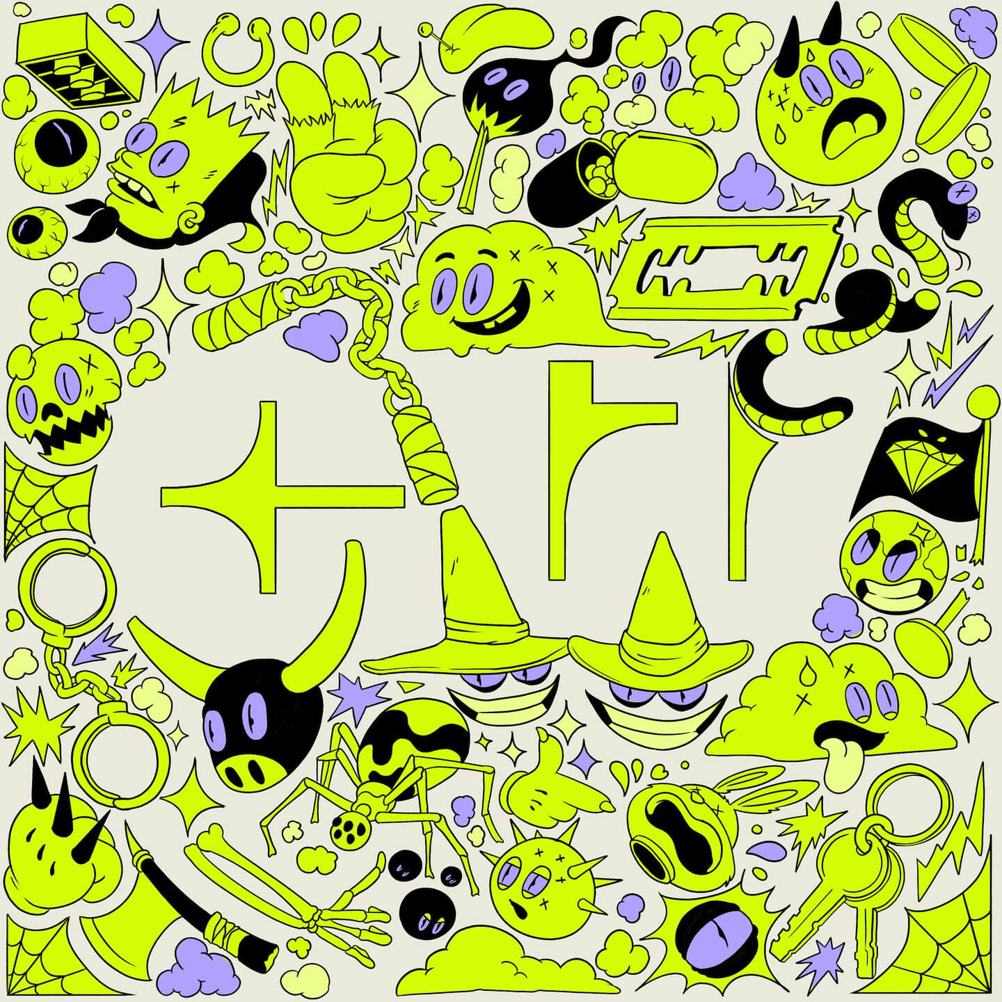
Another really interesting and creative design I wanted to share, is the Golden Wolf visual identity, from Koln. This Emmy-nominated animation studio has revealed a new identity, it’s first since it launched seven years ago. Based in New York and London, the company has worked with brands such as Nike, Facebook and Disney.
For its next stage of growth, Madrid based studio Koln was brought on board to create an illustrative rebrand, inspired by skate culture and graffiti art. The redesign also includes a new logo and website, and from working I this industry you learn the importance of keeping up with trends and staying relevant, which is why I really like this new design.

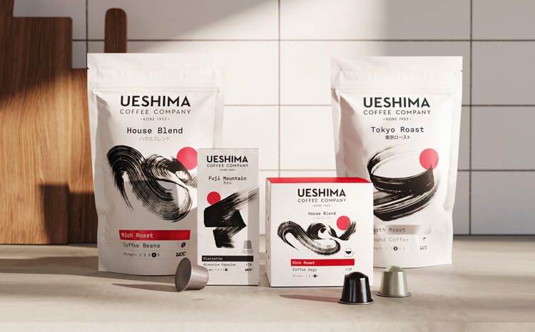
Moving onto the next design project, I thought I’d talk about is the UCC European launch. The Ueshima Coffee Company is one of Japan’s biggest coffee brands, who launched its first direct to consumer products for the European market with an identity that hopes to position Japanese design cues in a western setting. The logo, identity and packaging were actually designed by London design studio The Clearing, which I believe was to try and help them appeal more to the European market. Japanese calligraphy artist Kashuu was also commissioned to create bespoke illustrates for each pack, which aim to give a sense of specific blend’s experience and flavour.
Last but not least, the design I thought had to be on here was the 19 Artists vs COVID19 poster campaign. Paper manufacturer Fedrigoni has followed up last May’s poster series with a new campaign which aims to raise money for the NHS charities. The scheme asks creatives to design an A1 poster interpreting the “stay home” message and social distancing. Due to the UK’s current lockdown, the series are as popular as ever.

What are your thoughts on these design projects?
© GeoBrand. All rights reserved.